I’m a digital designer with more than 15 years of experience working on interactive projects for web, mobile, and site-specific installations. I’m currently a Product Design Team Lead at Datadog, where I manage a group of five designers and guide the design of products in the alerting space (Monitors, Incidents, Events and SLOs). Previously, I was the Digital Art Director for The New York Times Magazine, where I oversaw the design and production of the Magazine’s special issues and features. Apart from The New York Times, I have worked with other great companies and cultural institutions such as The National September 11 Memorial Museum, The Eisenhower Memorial, The National Museum of American Jewish History, The New York City’s office for Media and Entertainment and the Liceu Opera House in Barcelona.
The projects that I worked on have been recognized with awards by the Cannes International Festival of Creativity, the World Press Photo Foundation, the Cooper-Hewitt National Design Museum, the American Alliance of Museums, the Society of Publication Designers, the D&AD Foundation and others. For more details, visit my profile on LinkedIn.
I’m obsessed with problem-solving and get very excited about everything related to design, technology and storytelling. I also enjoy giving talks and organizing workshops on digital design and meeting new people.
Datadog’s Incidents Product: Three paths to document “What’s Going On”
Datadog
Outages are a big headache for most tech companies. Apart from fixing the problem, engineers need to coordinate the response, document what’s going on and identify key lessons. Datadog’s Incidents product provides an end-to-end solution to automate and speed up some of these tasks. This case study focuses on the features geared towards collection of data and documentation.
Role:
Research, Strategy, UX & UI Design
Background
Datadog is a cloud-based SaaS platform that offers monitoring and data-analytics of infrastructure, servers, databases, and other services.
Incidents is a product to help teams coordinate the response to incidents in their systems. This includes collaboration features, automation of tasks, and tools to produce documentation on what happened and how to prevent it in the future.
Product Goals
The Incidents product was born out of the intention to “productize” an internal tool that Datadog’s engineering teams used for incident management.
Each company tackles incident management in a different way but we were able to uncover some common goals that would resonate with both small companies (with less structured processes) and large ones (with more requirements and external tooling).
Broadly, these were the early goals for the product:
Keep all workflows as frictionless as possible. The fewer requirements the better. Incentivize users to declare incidents as soon as they need to — early and often is better in this case.
Respect the existing tooling and processes of customers and integrate with those rather than replacing them.
Keep the product highly customizable but simultaneously opinionated about what good incident response is supposed to be.
Reduce manual work as much as possible.
Challenges
The UI design phase was fairly short and there were limited resources on the design and product side compared to the speed expected from engineering. This meant accumulating a fair amount of design debt. Ultimately we favored multiple quick iterations and versioning over larger, more polished releases.
One of our goals was to improve the visuals of the product. However our design system was constraining, particularly for form design. So this redesign also pushed the boundaries of the design system to improve microinteractions and details without completely breaking with the precedent.
The initial set of goals underestimated the amount of requirements that customers really wanted. So, although many customers mentioned they would like to keep data collection and taxonomies pretty frictionless, the reality is that they ultimately needed much more structure and preset fields than estimated.
Incident management can start from everywhere. This meant there was less control on the user context.
Main Users
Datadog is aimed primarily for technical users — engineers or technical support — familiar with complex interfaces. However, users can be further differentiated by their seniority or experience and their level involvement in the Incident response.
An experienced engineer who gets paged and can quickly assess when something is really wrong
An engineer browsing the platform who discovers a few metrics hiccups along the way.
A Manager, who gets notified about a problem in the services of one of their teams.
Incident Scenario
In a typical incident there are four main phases:
Detection: A problem happens and gets detected by a user (generally an engineer). After an initial quick assessment, the user declares an incident to start the coordinated response.
Triage: The responders work together to identify the extent of the damage, contact relevant stakeholders and teams and identify the root cause.
Reparation: The cause is identified and mitigation efforts start to limit the impact. Afterwards numerous tasks are initiated to recover from the damage (lost data, availability of services, etc).
Retrospective: A responder lead (the incident commander) collects all final information as a retrospective or post-mortem that will describe not only what happened and why, but include lessons learnt, and outline a plan of future tasks to prevent this same problem from happening again.
Some users will participate in all four. For instance, an engineer detects and declares an incident and then stays as Incident Commander all the way through. Other users will take part at specific moments, like those responders who only join for the triage phase. Or external stakeholders that start watching the incident once it escalates to high severity.
My Role
I led the initial strategy and feature exploration in tandem with one Product Manager. I also designed the first few wireframes and UI of core features and prototyped a detailed demo to collect internal and external buy-in.
After the initial discovery phase and first round of design, I scoped out work for another designer while I continued owning the design of many core parts of the product. I owned the design on all the sections covered in this case study except for the post-mortem creation, which was designed by one of my reports.
More designers have progressively joined the team and as that happened I’ve taken the role of an advisor to make sure we approach problems from a holistic perspective.
Research & Discovery
Early on, the product manager and I interviewed over a dozen potential customers to understand their process, workflows and common toolset.
Separately, I interviewed about 7 Datadog engineers (primarily from our Site Reliability Team) to understand the wins and failures of the existing internal app and also to validate early ideas.
I also used previous post-mortem documents as a way to understand how the action unfolds.
Additionally I joined a couple of sessions to see incident management live. This was particularly interesting to uncover how most of the time spent happens outside the Incidents app or even Datadog, running commands on a terminal, posting updates on the Slack channels, and triaging through trial and error.
Design Overview
This case study focuses on 3 main views that are intended to collect information during an incident and how they are adapted to each moment in the user journey:
A declaration modal to with a set of adaptable entry points to capture things in context.
An overview page to fill out main fields like description, services affected…
A timeline view to capture the details of the triage conversations and signals like graphs, snippets of code… etc.
All three are redesigns on their first versions that were released as part of the product MVP. As such we had accumulated a fair amount of design debt and this was an opportunity to improve the experience overall.
User Stories
As an Incident Commander,
I want to capture relevant parts of conversations and updates so I can later understand the lifecycle of an incident
As an Incident Commander, I want to be able to provide summary information about the incident (symptoms, diagnosis…) so external stakeholders can quickly understand what’s going on.
As an Engineer joining an incident, I want to be able to quickly get context on where we are and the mitigation efforts we tried so far.
As a Manager, I want to be able to look at time between events and impact so I can better assess what went wrong with the response and the changes that we need to do to improve our process.
Expected Experience
To figure out what should go into each piece of UI, I created an “information journey” to set an expected experience about when and what the user will look at and fill out:
On Creation
Title
Severity
Signals
On Triage
Description
Customer Impact
Responders
User Messages
On Repair
Ends Impact
Root Cause
User Messages
On Resolution
Secondary Fields
Post-mortem
Remediation Tasks
Declaring an Incident
Declaring an incident should be frictionless and feel transactional. Users at this stage don’t have much information about what’s going on and asking too many questions will only confuse them. However there is an opportunity to capture the original context from which the user is declaring the incident and incorporate that context as signals — data, graphs or any indicator of something being wrong. These not only enrich the description of what’s happening but also carry metadata that can be used to fill out additional fields and find correlations with other Datadog resources (dashboards, logs… etc).
Users want to be able to start an incident response process from everywhere. As such there are many workflows that lead to declaring an incident. Some are: a monitor alerting, anomalies on some graphs, log errors, customers reaching out about an issue… Below is a diagram with the most common workflows that lead up to declaring an incident.
The Creation Modal
All these flows lead into a single modal. We decided on a modal rather than a full page form because we wanted to keep the process light and also constraint the amount of fields that users are expected to fill out. Most of the customers we interviewed mentioned that not only additional fields would increase friction (delaying the actual response process) but also that in many cases, they wouldn’t even know the answers to those fields.
We iterated a lot on both the information architecture and the style. Some of the existing design patterns like the numbered steps and the label style were detrimental to the ease of completion and to the general visual rhythm of the visuals. Ultimately I decided to use our components in new ways while staying within the principles of our design system.
In the first rounds, the content was structured around the theme (introduced in the UI by a numbered headline indicating steps). Later we realized that following a structure of required vs optional seemed more beneficial for the user.
Apart from the content structure I designed many variations to tweak the language. From internal feedback, one of the new goals for this form was to make it friendlier. I initially tried to address that with the right language tone while conforming visually to our design system precedents. Ultimately, there was agreement that full consistency with other forms (the numbered steps, the default label style, the use of icons…) was a constraint blocking this goal so we focused on expanding / redesigning the components or the way we use them.
With the final version (below), the required fields are at the top. Severity and Commander have default values so the only field that users really need to complete is the name of incident (which automatically is on focus). We felt it was important to incentivize users to notify others and provide context even if those fields are optional. Additionally we added a side panel that companies can use to add information about their response process, relevant links, examples or policies since it’s common that the users declaring incidents are not always very technical or familiar with incident procedures.
The Incident Button & Secondary Points
Cross-product features are always hard to roll out given the amount of stakeholders. We created a primary entry point, the Incident Button as a way to declare new or existing incidents from different parts of the platform. However, a big button wouldn’t work anywhere, particularly in the already dense UIs of some of the other products, like Dashboards. For those cases, we created additional secondary points from minimized buttons and context menus. For alignment, we centralized the implementation of all these options, but allowed the different product teams to decide which one would work best for their product and how much of a need to declare incidents would there be for their users.
Off-Platform Entry Points: Slack
Many organizations heavily depend on Messaging products like Slack, Microsoft Teams or Google Hangouts for workflows beyond communication. Datadog integrates with Slack to let users directly declare incidents from there and also keep track of their evolution using commands. In these cases, a less technical user needs to be supported. Customer support agents want to be able to call incidents from Slack so their engineering teams can start working on an issue discovered by them, or in some cases by a customer. Most often these agents are not Datadog users so we created the different use cases and provided a couple of versions of modals depending on the results of the match between Slack User and Datadog User.
Describing what happened
As mentioned, context and documentation are core aspects of incident response. Users will join at different stages so it’s critical that they can understand quickly where things are, previous repair attempts, etc… They need both a summary and access to details. Additionally, good documentation will ensure that the lessons can be learnt and the system can be improved to be more resilient. Traditionally, this documentation task falls on a responder who’s assigned the role of a Scribe. A Scribe keeps track of key events during an incident: changes in status, mitigation efforts, important findings… etc. That’s often very time consuming and a lot of details can be lost.
Given that a common output of an incident is a post mortem document, it makes sense to somewhat mirror the structure from the beginning. A post-mortem generally includes:
A Summary of what happened
A description of the cause (root cause analysis)
Main actions taken to resolve it
A timeline of the main activity
Lessons learnt and prevention to-dos
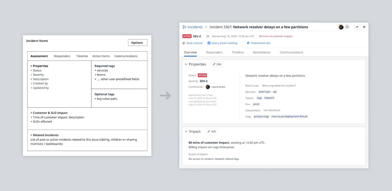
Previous Design
The first version of this page had the goal of providing something light in terms of content with just the fields that users needed. Additionally the intention was to rely on tag correlations to surface related content automatically (service objectives, related incidents…). However, this ended up being more difficult than expected. Additionally, subsequent rounds of feedback revealed that users wanted this page to provide context even when many of the fields on the page only get filled out at the very end. Hence came the idea of surfacing content from the other sections particularly the timeline which captures a lot of the granular activity happening.
New Design
The new summary tab is the most similar to that of a standard ticket but the information architecture is structured in a way that more obviously mirrors the content that needs to be collected for the post-mortem. It also adds a few preview modules that display automatic content to address the main pain point of the first version. The plan is to continue exploring other pieces of automatic content to be shown within this framework.
I tried a few options for the information architecture of the page, but ultimately decided to organize it around three main blocks:
Preview modules of the other sections. Users are not always disciplined filling out the data fields, so these additional modules automatically display information available elsewhere. One that users have found particularly useful is the timeline module, which presents time metrics on a condensed version of the timeline view.
Freeform fields to capture the core storyline of the incident. This column follows a structure similar to a general post mortem document (what happened, why, impact…)
Attributes sidebar including most of the other filtering fields. These tend to be filled out by the end of the incident as a way to organize incidents in categories that can be aggregated in themed reports (most frequent services or teams, relation between severity level and data centers… etc).
The final layout took all this in consideration, ordering the modules in the order that we expect are going to be relevant depending on the moment of the incident response.
Fields can be configured to be displayed within any of the main sections (what happened, why, impact and attributes). The goal here is to place these fields where they feel relevant rather than as a long unordered list that the user is supposed to fill out.
Additionally the impact section gets some special treatment, allowing users to create multiple blocks of impact and measure the time metrics associated with it in a more granular way.
Capturing Triage Efforts
The core of the responder experience happens outside the incident product. Apart from actually coding to fix the problem, responders communicate in a single channel their findings, and share graphs, code and other pieces of information. Many of these are valuable to later get the full picture of what happened. The timeline view is the place to capture all this activity. It’s inspired by a traditional activity view but merging that idea with the content flexibility of a messaging app. Additionally the design emphasizes time as a core measure that can be used to improve incident response or set quantifiable goals.
With the Datadog Slack app, users can declare incidents directly from Slack, query status updates and create tasks. They can also send messages to be saved on the timeline view. These user messages are aggregated along incident updates like changes on status, severity, customer impact, tags… to capture further details about the steps that responders took to fix the issue.
Graphs and other signals are often scattered between slack, dashboards and documents. By adding these to the timeline, responders have a central place to interact with them, and also entry points to shared integrations like PagerDuty or Github.
The decision to call this a timeline and not activity came from the desire to make this more explicitly a time tracking view. Certain updates like status, severity or customer impact are automatically marked as important to improve scannability and users can mark additional ones.
Additionally, this timeline intended to be a representation of what actually happened, not when it got logged. With that in mind, users with admin access can fully edit the entries, including the timestamps to retroactively correct inaccuracies. For instance, if they want to note when the incident was really detected or when it was resolved (instead of relying on when the Incident Commander entered that information). That way there is less pressure to update the information precisely when it happens.
Some of these timestamps are critical to calculate time metrics (e.g time to detection, time to resolution) that can be surfaced on the incident overview and in future reports. They make the response performance quantifiable and help set goals for improvement.
Bringing All Together: the Post-Mortem Doc
The Incident post-mortem document is where all this information comes together. Users can create a post-mortem with a couple of clicks. Here, I provided guidance to another designer to create a “wizard flow” so users can select the information relevant for them and export it to “Notebooks”, Datadog’s docs editor.
In the post-mortem notebook, copied graphs are still interactive, and users can further edit and integrate the document with the rest of Datadog’s ecosystem. This document can also be converted to a PDF so external stakeholders can access it. Over time, the plan is to support other platforms like Google Docs, Jira Confluence… etc.
Conclusion
The feedback received on these redesigns have been very positive. From a visual point of view, the new design set new precedents pushing and expanding components and layout in our design system.
From a functionality standpoint, customers have been enthusiastic about many of the features among which:
The ability to customize not only input fields but also the help provided along the way — since different companies have different criteria for declaring an incident and setting a severity level, for example.
The emphasis on time, both on the visual presentation standpoint and in the way we use that data, by producing time metrics like time to detection and time to resolution that can be graphed out and compared and represented as a condensed timeline).
The explicit ad-hoc content structure that facilitates a constructive, analytical approach in their retrospectives.
The flexibility of the timeline view to connect with their communication tools and other integrations.
So far most of the validation has been qualitative, through interview validation. As this product evolves, we’ll collect more quantitative metrics about the frequency of use of these new features, their discoverability and overall usability which will inform the next iteration.